Choco fruits
Nature's sweetest treats dipped in decadence
Branding
graphic Design
About Choco Fruits
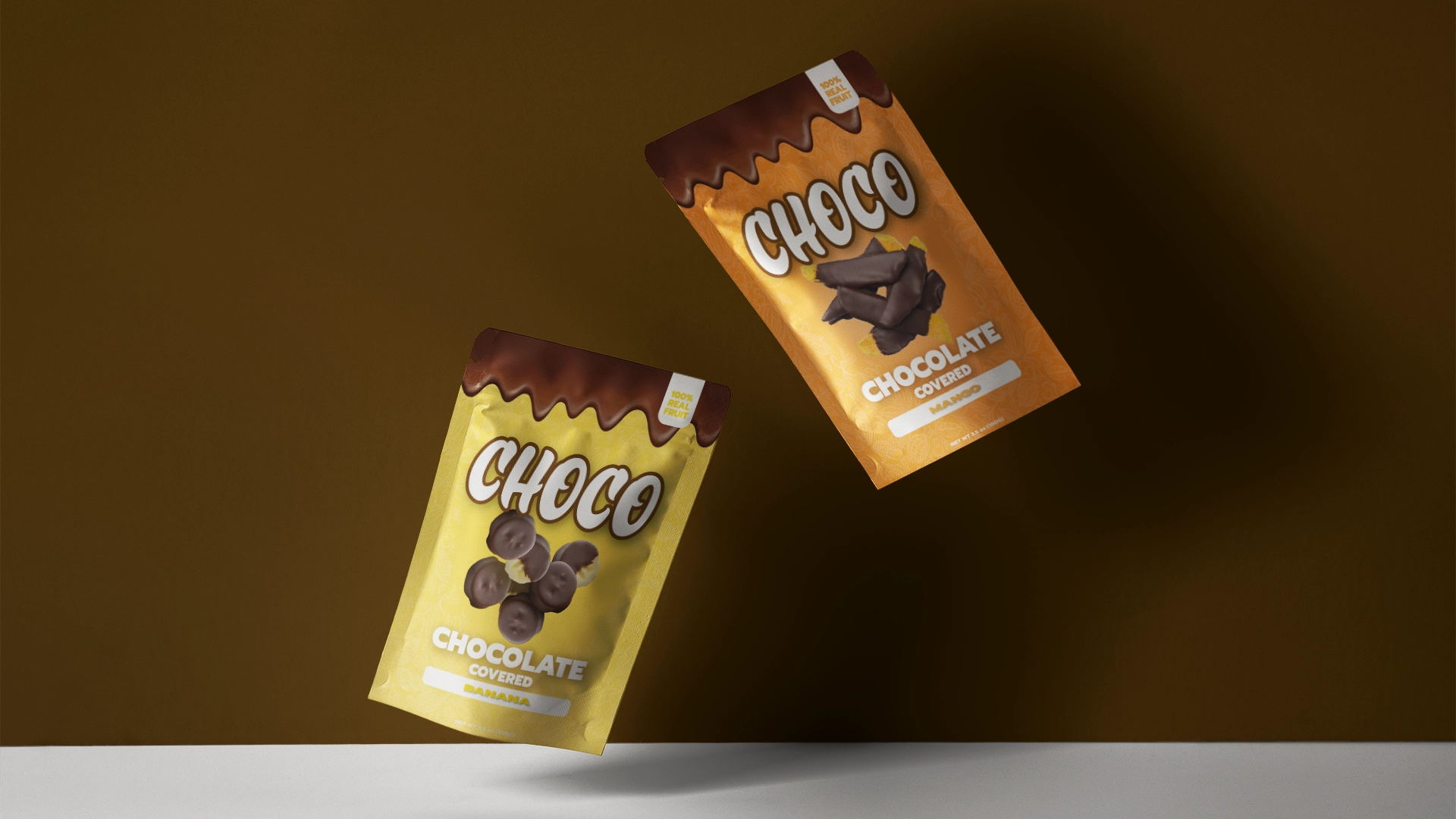
Choco was a chocolate-covered fruit snack brand created by the same friend behind Frostbites. They focused on chocolate-covered freeze-dried mangoes and bananas, offering a snack that was both healthy and indulgent. When my friend approached me, he needed pouch packaging for these two products and a brand identity that would appeal to a younger audience. Unfortunately, rising cocoa prices meant the product couldn’t go into production, but this project gave me a great portfolio piece that showcases my skills in packaging and UX design.
Brand Vision & Concept
The goal for Choco was to blend the healthiness of fruit with the sweetness of chocolate, while still keeping the brand organic and approachable.
- Wordmark Design: I created a bold and playful wordmark that highlights the chocolate aspect and gives the brand a fun, recognizable identity.
- Color Palette: Bright colors inspired by the fruits were softened into pastel gradients with a hint of white, making the designs feel fresh and natural. These colors paired perfectly with the matte finish planned for the pouches.
Balancing fun, health, and indulgence was a challenge, but I think the final result struck the right tone for the brand.

Design Process
1. Concept Development
My friend gave me a lot of creative freedom with a few clear guidelines. I started with several design concepts to see what resonated with him, and after some tweaks, we finalized the packaging for mango and banana.
2. Imagery Challenges
One of the biggest hurdles was the lack of product photos:
- For mangoes, I worked with sample images he provided, using Photoshop to enhance and fit them into the design.
- For bananas, I found copyright-free images online and spent time in Photoshop editing and processing them to look natural and cohesive with the overall design.


3. Final Packaging
The final designs were clean and fun, with a bright, pastel gradient look that stood out while staying true to the brand’s natural and healthy vibe.


3D Design & Mockups
For this project, I used Adobe Dimension for the first time to create dielines and mockups for a display box. Seeing my designs come to life in a 3D space was a fun experience and sparked my interest in exploring more 3D design tools.


Reflection
The main challenge in this project was creating a look that stood out on the shelf while still feeling approachable and natural. I think the final designs captured the balance between fun, health, and sweetness, and spoke to the younger audience we wanted to target.
Even though the product didn’t go into production, I learned a lot from this project, including:
- How to solve creative challenges in packaging design.
- Advanced Photoshop skills for photo editing and image integration.
- Using Adobe Dimension for 3D mockups, which I really enjoyed.