Frostbites FREEze dried fruits
THE PERFECT ON the go snack for any occasion
Branding
graphic Design
About Frostbites
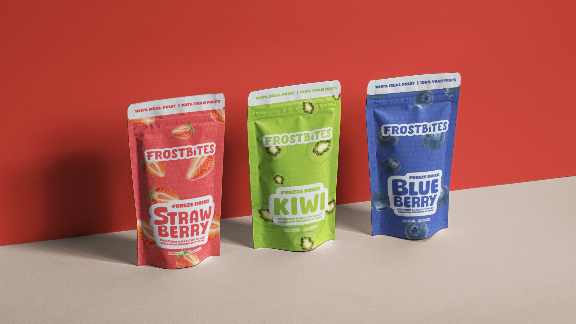
Frostbites is a freeze-dried fruit company created by a good friend of mine, and it’s quickly growing in popularity, now available in over 60 stores across the Lower Mainland. The product lineup includes freeze-dried strawberries, blueberries, mangoes, dragon fruit, and kiwi—healthy, delicious snacks that appeal to all ages!
My friend reached out to me to rebrand Frostbites' packaging. He felt the existing packaging was too generic and he wanted something that would catch the eye on a crowded shelf. My role was to create a brand identity that felt approachable and natural, while focusing on the fruit itself in a simple, cohesive design. The project included developing a simple wordmark logo to help the brand stand out and feel more complete.


Brand Vision & Concept
My goal was to develop a brand that conveys fun, healthy snacking in a way that feels vibrant and natural. I focused on creating an approachable and friendly look with a simple, clean wordmark logo—something the brand had been missing.
To establish consistency, I chose colors inspired by each fruit in the lineup, creating a cohesive set that maintains a unified aesthetic across different product variants. I wanted each package to be instantly recognizable, with bright, natural colors that match the fruit, making it both visually appealing and easy to identify.
Balancing a "fun and healthy" vibe was key for this project. I wanted to avoid making the packaging look too much like candy, instead highlighting Frostbites as an all-natural, health-conscious snack for people who crave something sweet but nutritious.
Design Process
1. Creating the Visual Identity
Logo Development: I started with a clean, straightforward wordmark that would look great across different packaging formats. Adding a snowflake on the logo was a little detail to showcase the freezing aspect of the company. The idea was to make the logo feel friendly and modern, reflecting the brand’s emphasis on simple, healthy snacking.
Color Palette: For each flavor, I chose colors inspired by the fruit itself, like bright reds for strawberries and bright greens for kiwi. By keeping a consistent tone throughout the color palette, the packaging feels cohesive across the entire range.

2. Packaging Design
Exploration & Concept Design: I began with the kiwi package, trying out a few different layouts and font styles to capture that balance of health-focused and inviting. I created three distinct concepts, each with varying text placements and fruit visuals, all in line with the brand’s personality. After my friend reviewed them, we landed on one design with some small adjustments to get the look just right.


Building a Unified Look: Once we finalized the kiwi design, I used it as a blueprint for the other flavors. I swapped colors and fruit images to keep the layout consistent, ensuring the product line looked unified but still allowed each flavor to stand out.

3. User-Centric Design & UX Considerations
Shelf Presence & Visual Consistency: From a user experience perspective, I wanted Frostbites to have a clear, standout look that’s easy to spot on the shelf. By keeping the layout, color scheme, and logo placement consistent, each package fits into the brand family, making it instantly recognizable.
Balancing Fun with Health: The biggest challenge was striking the right balance between making the brand feel fun and highlighting it as a healthy snack option. I aimed to communicate that Frostbites is a natural, nutritious choice for health-conscious consumers, appealing to both families looking for wholesome snacks and adults seeking a sweet yet guilt-free option.
Frostbites Freeze-Dried Fruits


